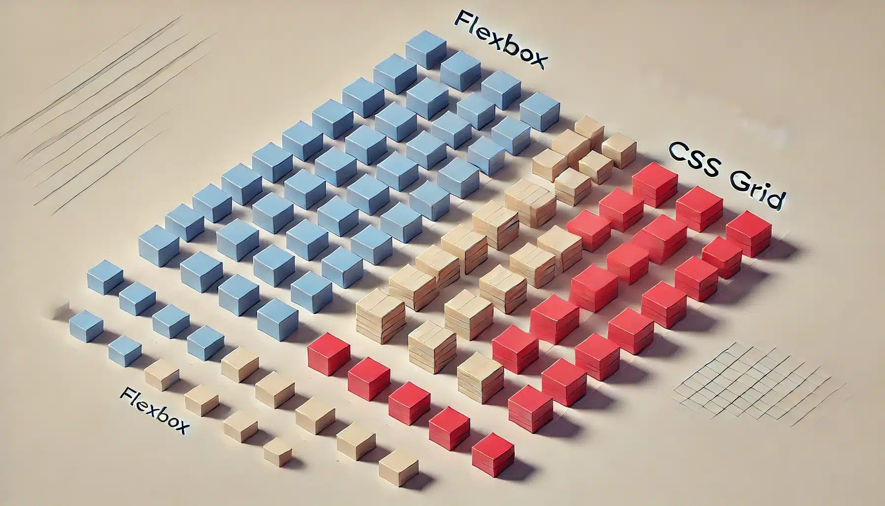
CSS Grid and Flexbox: Layouts Made Easy
In modern web development, CSS Grid and Flexbox have transformed how we approach page layouts. They make creating responsive and adaptive designs more intuitive and less reliant on traditional methods like floats and positioning. In this article, we’ll explore the basics of CSS Grid and Flexbox, how to use them, and when each should be applied.
If you’d like to read a summary of this article, head over to the OptimistDev newsletter on LinkedIn. Stay updated with our latest tips and insights on web development! Click Here to read Summary
Table of Contents
- Flexbox Basics
- Example: Flexbox Layout
- CSS Grid Basics
- Example: Grid Layout
1. Introduction to CSS Grid and Flexbox
CSS Grid and Flexbox are both layout systems designed to simplify the creation of flexible, responsive layouts. However, they serve different purposes:
- Flexbox is best for one-dimensional layouts (either a row or column).
- CSS Grid excels at two-dimensional layouts (both rows and columns).
Both methods are modern alternatives to older layout practices, offering enhanced control and simplicity.
2. Flexbox: One-Dimensional Layouts
Flexbox Basics
Flexbox, or the Flexible Box Layout, allows you to arrange elements in a single direction, either row-wise or column-wise. It provides powerful alignment options, making it ideal for small components like navigation bars, buttons, and item arrangements.
Key Flexbox concepts:
- Main Axis: The direction in which the items are laid out (either
roworcolumn). - Cross Axis: The opposite direction, used for alignment across the main axis.
To use Flexbox, you set the parent container’s display property to flex. Then, child elements can be arranged using properties like justify-content, align-items, and flex-grow.
.container {
  display: flex;
  justify-content: space-between; /* Align items along the main axis */
  align-items: center; /* Align items along the cross axis */
}

.item {
  flex-grow: 1; /* Allow items to grow to fill space */
}
Example: Flexbox Layout
Consider a simple navigation bar:
<div class="navbar">
  <div class="nav-item">Home</div>
  <div class="nav-item">About</div>
  <div class="nav-item">Services</div>
  <div class="nav-item">Contact</div>
</div>

<style>
  .navbar {
    display: flex;
    justify-content: space-between;
    background-color: #333;
    padding: 10px;
  }

  .nav-item {
    color: white;
    padding: 10px;
  }
</style>
This layout evenly spaces the navigation items across the navbar using Flexbox. The justify-content: space-between property ensures that the items are distributed with equal space between them.
3. CSS Grid: Two-Dimensional Layouts
CSS Grid Basics
CSS Grid Layout is a two-dimensional system that enables web developers to create both rows and columns with ease. It’s perfect for complex designs like photo galleries, portfolios, and other grid-based layouts. Unlike Flexbox, which handles only one axis, Grid handles both axes at once.
Key CSS Grid concepts:
- Grid Container: The parent element with
display: grid. - Grid Items: The child elements within the container.
- Grid Tracks: The space between lines, formed by rows and columns.
- Grid Areas: Named areas within the grid that allow for advanced placement.
You define a grid by specifying the number of columns and rows. The syntax looks something like this:
.container {
  display: grid;
  grid-template-columns: repeat(3, 1fr); /* 3 equal columns */
  grid-template-rows: auto; /* Rows based on content height */
  gap: 10px; /* Space between grid items */
}

.item {
  background-color: lightblue;
  padding: 20px;
}
Example: Grid Layout
Let’s create a basic photo gallery using CSS Grid:
<div class="grid-container">
  <div class="grid-item">1</div>
  <div class="grid-item">2</div>
  <div class="grid-item">3</div>
  <div class="grid-item">4</div>
  <div class="grid-item">5</div>
  <div class="grid-item">6</div>
</div>

<style>
  .grid-container {
    display: grid;
    grid-template-columns: repeat(3, 1fr);
    gap: 10px;
  }

  .grid-item {
    background-color: #333;
    color: white;
    padding: 20px;
    text-align: center;
  }
</style>
This grid creates three equal-width columns and places each item into the next available grid cell. You can customize this further by defining specific placements for grid items.
4. When to Use CSS Grid vs. Flexbox
Both CSS Grid and Flexbox have their strengths, and choosing between them depends on the layout you’re trying to achieve:
- Use Flexbox for simpler, one-dimensional layouts. Examples include navigation bars, headers, and footers, where elements are aligned along a single axis.
- Use CSS Grid for more complex, two-dimensional layouts, like galleries, portfolios, or content sections with rows and columns. Grid allows for greater flexibility and control over both dimensions.
Flexbox vs. CSS Grid Quick Comparison:
| Feature | Flexbox | CSS Grid |
|---|---|---|
| Layout Type | One-dimensional | Two-dimensional |
| Main Use | Simple rows or columns | Complex grids (rows & columns) |
| Flexibility | Great for responsive design | Advanced placement and spanning |
In some cases, combining both can provide the best result, especially when you want one section of your page to follow a grid and another to follow a flexible row or column.
5. Conclusion
CSS Grid and Flexbox have revolutionized how we approach web layouts, offering developers simplified methods for creating responsive, adaptable designs. Flexbox is the go-to for one-dimensional layouts, while Grid excels in complex two-dimensional designs. By mastering both, you’ll have the tools needed to tackle any web layout challenge with ease.


